
Accessible design for learner variability: Presentations
Accessible Presentations/Slides (e.g. PowerPoints)
This blog post outlines how to ensure your MS PowerPoint (PPT) slides are fully compliant in terms of accessibility. Although the principles are the same, there is also more specific guidance available for Mac/Keynote. When creating a PPT, there are a few basic steps that should be followed in order to ensure your content is accessible, and that it follows the same principles as text document and video accessibility.
CED have developed an Accessibility Checklist for staff that incorporates a full list of inclusive accessible design practices when developing content, that is underpinned by Universal Design for Learning (UDL) principles of multiple means of engagement, representation and action and expression. Accessibility is about designing courses and developing a teaching style to meet the needs of people from a variety of backgrounds and abilities. It is a way to make documents, presentations and content easier to navigate, read, and transform, so that it’s user-friendly, interactive and collaborative.
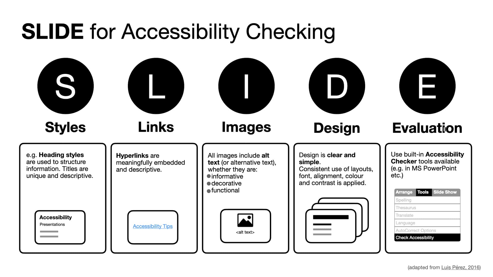
Whilst a common way to present information during lectures and sometimes in tutorials, seminars and labs is through PPT, the learner experience can be very varied. When developing content, material and resources it is best practice to think about Accessibility and how everyone benefits when barriers are removed for learners. A simple way to think about Accessibility when creating PPT presentations is the mnemonic SLIDE, developed by Luis Pérez at CAST.
The following tips were developed to support staff to think about Accessibility when developing content through the medium of PPT presentations/slides.
View our Accessible Presentations poster, listen to an audio version, or watch the video below for a quick overview of these 10 top tips.
1. Slide Layouts
The most important part of PowerPoint accessibility is the use of slide “layouts.” Used correctly, these will ensure information on the slides have the correct heading structure and reading order. Most slide layouts include a slide “title,” usually at the top of the slide. They also typically contain one or more “placeholder” areas where you add content like lists, images, and tables to each slide. The title will be presented as a heading to screen reader users, and will be the first thing read on each slide. If each slide has a descriptive title, this will make it much easier for screen reader users to read and navigate the presentation. You can also create your own accessible layouts by using the Slide Master View.
2. Headings and Sub-headings
Use a unique title for each slide heading to provide structure and ensure ease of navigation. Headings assist screen reader users and all learners ease of navigation. Headings font size should be minimum 36pt. Sub-headings provide additional navigation when defining a move to a different point or context, trying to get more than one point across and signals a break/change for the reader.
3. Text and Font
Use simple and clear language. Guide learners to a Glossary of Terms for all common words that continuously need to be referred to in the module. This may be obvious to many, but large blocks of texts are not effective and can be a barrier and distraction for many learners. Just like text documents use a readable Sans Serif font (e.g. Arial, Helvetica and Calibri). Use a minimum point size of 24 for all slide text. With sequential information use bullet points or visually represent content using a flowchart or timeline to make it easier to follow. Avoiding adding extra text boxes but instead use the pre-set boxes in the standard templates available. Left justify the text.
4. Colour
Colours serve a far more critical function to highlight a point, make your slide deck look consistent, guide students to in a certain direction, convey emotions and make your message memorable. There is no universal ‘best practice’ colour contrast usage, only user preferences. Use high contrasting colours to differentiate between the text and background. Think about lightness as well as colour contrast. In a dark room use a dark background with light text. In a light room use a light coloured background with dark text. Ensure there is a decent contrast between background colour and text colour and use a contrast ratio checker to aid your colour choices. Black text on a white background or dark blue text and a cream background have been shown to be a good combination. Use more than colour to represent meaning, such as colour and text/shape. For example if you say click the green button to start and the red button to stop, it would be more accessible to have the words ‘start’ embedded in the colour green and ‘stop’ in the colour red.
5. Hyperlinks
Hyperlinks are a great way to guide learners to a number of other related content or websites. Instead of using ‘Click here’ for ‘more info’, it is more effective to provide descriptive and meaningful context to create accessible hyperlinks. Do not include long URLs into the text as this is particularly difficult for screen reader users but instead embed the link into the text to provide a direction of where the reader is going to end up after clicking the hyperlink.
6. Alternative Text
Add ALT (alternative) text to make sure visuals such as images, charts, logos and diagrams have alternative text descriptions. Every visual that conveys content or has a specific function should be given alternative text. Decorative images do not require ALT text. ALT text has a limited number of characters, so make sure you use the most apt and informative text you can to describe any images in your documents. Applying alt text to a shape, picture, chart, table, SmartArt graphic, or other object is a simple way to make your document more accessible.
7. Images, Charts and Diagrams
Images are a great way to present information, rather than an over-reliance on text. However, to ensure that all non-text content e.g. images are accessible they must have a text equivalent or description. Where an image conveys a message, use ‘ALT’ attributes to provide a text equivalent and describe what the image represents. Provide enough detail to convey the meaning. For images or charts that have an image but the image is not important but includes some text, it is important for the text to be included within the ‘ALT’ attribute. However, it is better to avoid text overlays on an image as they can be difficult to read. Resize and crop images to focus the reader and keep files to a manageable size. When adding images to your document, make sure you add meaningful alt text that conveys the context and meaning of the image in as effective a way as is possible. Similarly, add a caption to your image that is useful to readers and learn about how to produce accessible equations, graphs and tables (e.g. following Benetech Diagram Guidelines).
8. Tables
Ensure tables are accessible in PPT and rather than taking a screenshot of a table and adding it as an image, ensure it is inserted as a table so that the content is accessible to those using screen readers. Keep the structure simple, and bear in mind that screen readers will read the content from left to right, top to bottom, when deciding on a structure. Add alt text to meaningfully explain your table to visually impaired readers and add an informative caption.
9. Accessibility Checker (MS PPT, Google Slides and Mac)
Testing the accessibility of content developed allows you to identify any usability issues that may have been missed. Following the guides in this Series will minimise any issues around Accessibility as good practice will become the norm. All checkers have limitations, so it is better to think about Accessibility in the design phase and learn best practices. All MS office applications, Mac and Adobe apps come with built-in accessibility checkers. Use the different checkers for PowerPoint in Microsoft, Mac and use Grackle for G Suite to check Google Slides.
10. Captions, transcripts, and audio descriptions for multimedia
You can add lots of different types of media to a presentation. With multimedia it is likely that the audio and visual content are both key to the meaning and delivery of the message so adding captions, subtitles and audio descriptions will make material accessible to hearing and visually impaired users. A simple way to produce captions directly in PowerPoint is to use for your lecture is to use Microsoft Presentation Translator.
If you are using Microsoft Teams to screencast a PPT presentation, auto-captions will be provided in the recording in Microsoft Stream.
Remember!
- All accessible PPTs should be uploaded to Canvas at least 24 hours in advance of the class. Provide a PDF version and a non PDF version so learners can edit the font and colour, add notes and hyperlinks.
- Use the notes field to expand any important content or to summarise key points in more detail. In particular, if you have detailed graphics, figures or images.
- Upload your presentation to OneDrive and save any changes or updates. Share the link with your students so that they always have the most recent version.