Poverty and social deprivation is an issue that we have not really dealt with in our study in the past. However, it is a very relevant issue that we are becoming more interested in. Some of our recent interest has been sparked by research that colleagues in our School of Social Sciences, Education and Social Work have been involved in together with other colleagues in England, Wales and Scotland. We are hoping to soon host a blog post in relation to their findings.
Thus, we have been going back to the original data that was collected back in 2000 for the full population that we have in our study (n=374), in order to establish what type of economic and social neighbourhood background they came from originally. These were the children who were in public care in Northern Ireland under 5 years old on the 31st March 2000. In order to determine the level of social deprivation of the area/neighbourhood the children came from, we used the NINIS (Northern Ireland Neighbourhood Information Service) website, which includes information on the Northern Ireland Multiple Depression Measure (NIMDM) 2010. The Northern Ireland Multiple Deprivation Measure (NIMDM) 2010 provides information on seven types of deprivation and an overall measure of multiple deprivation for small areas. We introduced the postcodes of the addresses where the child had been living prior to becoming looked after or that of their birth parent/s’ address (if child was taken at birth or had been living in an assessment centre) into this website to identify the children’s Output Areas (OA). Output Areas (OA) are ordered from most deprived to least deprived on each type of deprivation and then assigned a rank. The most deprived Output Area is ranked 1, and as there are 5,022 Output Areas, the least deprived Output Area has a rank of 5,022. We found postcodes for 353 of the 374 children. We only recorded the overall measure of multiple deprivation. We then divided them into five percentiles, 1 being the least deprived area and 5 the most deprived. The infographic in this LINK summarises what we found. It also includes information on other socio-economic variables that were recorded in 2000. You can also see it in the figures below
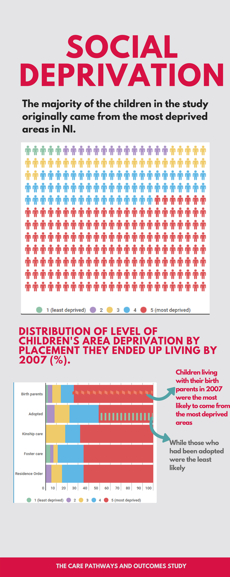
Great work Montse! I know it was a labour of love to manually track down and capture all those postal codes, but the results were worth the effort. Such striking findings, and your first graphic is particularly compelling in showing the association between deprivation (could you break down for us what this construct means please?) and vulnerability to needing care. Clearly, deprivation (which I presume is a measure of poverty) is a significant variable that needs to be taken into account.
The second graphic with the stacked bars is also interesting, particularly if we look at the bars that are not red. If we combine quintiles 1 and 2 (red plus blue), then foster care suddenly emerges as drawing a markedly deprived group of children.
And then we also notice that kinship care is the only area to have no children from quintile 1 and 2 settings (at least, not that the graph can show), and the second highest number of children coming from quintiles 1, 2 and 3 (after adoption). I suspect in South Africa, kinship care would be the predominant form of alternative care in poor communities, so this is an interesting difference in Northern Ireland.
Thanks very much for your comment, Adrian. The measure is an overall measure of deprivation, which combines 7 forms of deprivation, including income, employment, proximity to services, crime, etc. It refers to the particular areas where the children’s parents were living when they were born or shortly after. We are still not that sure ourselves what it all means, particularly the second graph. We are going to try and complement these data with other related information. There’s still quite a bit of work to be done. Yeah, children who ended up living with either their parents or relatives appeared to come from the most deprived neighbourhoods, as you say those in kinship care didn’t come from quintiles 1 and 2, which are the most well off, they all came from either quintiles 3, 4 and 5, which are the most deprived. It will be interesting to compare our data with that of other places like South Africa. Thanks again for the comment.
Thanks for the reply Montse. Interesting and would be interesting to get comparative data in other contexts.