Following on from the last two blog posts: Disability Services and Assistive Technologies at Queen’s University, we want to consider audience members with specific needs.
This week, we start off considering audience members living with blindness and low vision. If you are a content creator, this post will guide you towards considering different audience member needs and designing content to be inclusive.
Blindness, poor/low vision
People living with blindness may have no vision (completely blind), low vision or deteriorating vision (partial blindness).
If someone is completely blind, they cannot see anything. Partially blind people may perceive light and dark and/or colour. People whose eyesight has deteriorated may/will have experience of the world from previously having vision.
Around 2 million people in the UK are living with sight loss and 350,000+ are registered blind or partially sighted and there are support groups such as the Royal National Institute of Blind People (RNIB).
What we want to explore is how digital content needs to be designed for blind/low vision audience members, what Assistive Technologies (ATs) are available and some 3rd party apps which can be downloaded to assist.
Accessible design for the blind
Accessibility is an important topic to ensure the digital content we create is accessible for all users. This will require adapting materials and this should be embedded in to our practices.
Let us ask, if you were blind what teaching materials could you not use? Books would be irrelevant as content wouldn’t be accessible. Books with braille would be required, reading through touch. Detailed visual information (video, images, charts, graphs, etc.) isn’t accessible either.
When one of our senses isn’t available, other senses become more honed. Touch. The fingertips can feel items and this helps detail an item to the person and this works well for in-class scenarios where items can be touched.
Braille has been available for years and more recently, refreshable electronic braille displays. This works well for text and is good for online learning content.
Taking this into consideration, let’s look at practices to avoid and include as content creators.
Practices to avoid
Please avoid the following practices when designing content for audience members with vision impairment:
- Text as images (screen grabs)
- Text boxes
- Missing ALT Text descriptions
- Unstructured text (MS Word)
- Non-sequenced slide content (MS PowerPoint)
Text content as images
These are pixels grabs of information copied from documents, slides or screens which changes the words as text to words as pixels. Why is it important to avoid this? Well, screen readers won’t pick up text as pixels. This leaves a gap in information and potential learning. It disadvantages users of screen readers as the information is missing and ALT text decriptions may be insufficient.
If content creators do need to copy content from documents, slides or a screens, please copy and paste the text as text (this gives screen readers access). Do NOT screen grab information as pixels, this excludes some audience members.
We have seen text information in the form of timetables, rubrics and table information as screen grabs, this is not good practice. Whilst screen grabs are OK for sighted users, it disadvantages blind users.
Text boxes
When it comes to labelling images, text boxes may be inserted. Text boxes do not get picked up by screen readers and this crucial information is omitted from audience members with vision impairment.
Missing ALT Text descriptions
Again, missing ALT Text descriptions leaves gaps in information and learning. This disadvantages audience members with vision impairment.
Unstructured text (MS Word)
Think about using music cassette tapes (more on this later). It’s linear information where one song follows the next (as per the song index). Let’s liken this to unstructured text, this leads screen reader users to access content linearly. One section of text follows the next and there may not be an index available.
This is timely and there’s no way of the user knowing the information they seek is even available.
It can be assumed unstructured text may use colour formatting to highlight key concepts. Screen readers won’t pick up and convey that colour information. The nuances of visual communication are lost and this disadvantages screen reader users.
Non-sequenced slide content (MS PowerPoint)
Imagine making a cake. There are a number of steps in the process of making a cake:
- buy ingredients
- mix ingredients
- put mix in oven and bake
- remove from oven, let cool
- decorate cake
You cannot make a cake by mixing your ingredients before buying the ingredients. It’s a set sequence. Yet, some PowerPoint slide content are out of sequence when it comes to using screen readers. By this, the main content or a footnote could be read before the slide title.
Along with this, inserting text into text boxes will be omitted and visual content without ALT Text descriptions are another gap in information.
This is disorientating for screen reader users as the available information can contain gaps and be out of sequence. It can lead to confusion and it takes time for the user to make sense of the information. These are clearly disadvantages.
Now let’s have a look at practices to include when creating content.
Practices to include
The following practices should be incorporated into your workflow when designing content for audience members with vision impairment (for blind and audience members with low vision):
- ALT Text descriptions
- Text structure (MS Word)
- Highlighting key concepts using alternatives to colour
- Provide speaker notes (MS PowerPoint)
- Use content boxes (MS PowerPoint)
- Sequence slide content (MS PowerPoint)
- Consider audio
- Keyboard accessibility
- Descriptive links and buttons
- Manual font size adjustment
- Colour and contrast
ALT Text descriptions
Any information which is not text (photo, video, audio, etc.) should have an ALT Text description attached. These descriptions can be a one or two line comment on what the visual content is. For example, the ALT Text for the image below would be: coloured pencils tips for colouring in.

Sometimes an image may be decorative. Ensure decorative images are marked as decorative (on the Canvas VLE) or use “” (MS Word / PowerPoint) as decorative images won’t add anything to students’ learning.
The ALT Text can be picked up by screen readers (such as Narrator/JAWS) and the information conveyed to the audience member.
Text structure
Many content creators using MS Word are guilty of using text but not structuring text. They just start typing and format text visually.
It’s 2021. Remember cassette tapes? If you wanted to hear a particular song on a cassette you consulted the song index and you had to go through the tape in a linear fashion to get to the song you wanted. You didn’t have a choice and this was the same process for everyone.
Fast forward to the CDs era, now if you wanted to hear a particular song, you could choose the track you fancied from the song index. This saves time and effort going through all song content to find the one you want.
This example is true for unstructured text content when used with screen readers. Screen reader users have to go through all content to find the information they want. This is slow, it wastes time and the information screen reader users seek may not be in the document at all.
Structure the content!
Make it more like the CD example where screen reader users can choose the relevant information to be consumed. In MS Word, simply select the text (don’t use just bold, italic and underline to format text, this may be OK for sighted users but disadvantages non-sighted users) and use Formatting Styles under the Home Tab and Styles.
This builds structure into documents and gives screen reader users the option of listening to headings, subheadings, etc., to navigate around the information. This saves time and effort.
It would be an advantage to also include a table of content for longer documents, again to help navigate and save time. By using formatting styles, this allows screen readers to announce headings, subheading, etc., to audience members.
Highlighting key concepts using alternatives to colour
When formatting text to highlight key concepts, it’s important to note screen readers do not care about the colour of text. Avoid using colour alone to highlight important messages within text and think about how you format text to draw attention to its importance.
As MS Word users, you can modify Style formats which tags text ‘behind the scenes’. This tagging gets spoken to screen reader users. You might want to rename the style to make it more obvious this is a key concept and/or important information.
Even for sighted audience members, content designers may frequently use bold, italic and underline on text to highlight and make key information stand out.
Some users overuse this formatting and it loses the intended impact. If everything is highlighted, what is the key information?
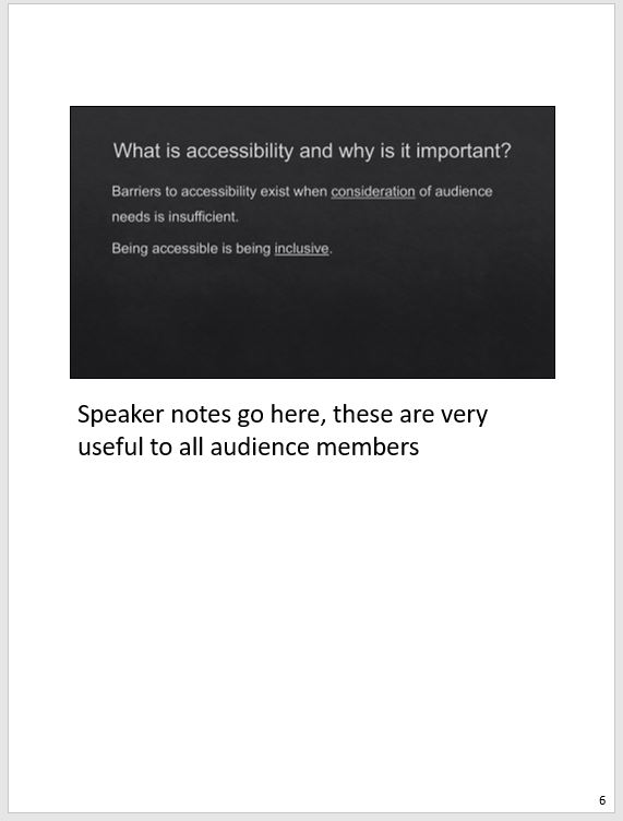
Provide speaker notes (MS PowerPoint)
In MS PowerPoint, if speaker notes are used and PowerPoints are shared with students, speaker notes are available to students (this will be in text format and screen readers can convey this content to audience members). This adds to the richness of content available and it is an advantage for all audience members.
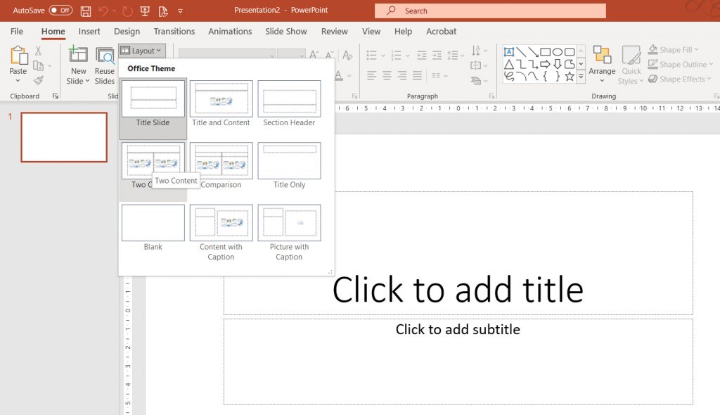
Use content boxes (MS PowerPoint)
When slides are created, it’s important to use slide templates and the content boxes available. There are a number of slide layouts available which can be used. It’s very important images and/or text are contained within the content boxes and not inserted outside of them.
Text added using text boxes and images just pasted onto slides are not seen by screen readers. However, if images are inserted into the available content boxes, these are picked up by screen readers. Remember to add ALT Text for visual information.
This can pose problems for content designers where multiple images are required on the same slide and they are limited by the number of content boxes available. One solution here is to combine multiple images into one or use multiple slides to separate images out.
Sequence slide content (MS PowerPoint)
When creating PowerPoint slides, click on the slide (away from all content boxes) and press the Tab key. This should highlight a content box. Pressing Tab again will move you to the next content box.
By using the Tab key, content creators can check the sequence of information within each slide to show the sequence screen readers will read the content. It’s important to ensure the sequence is correct and if it’s not in the correct sequence, this can be fixed in MS PowerPoint by clicking the Home Tab, Arrange and Selection Panel (below).
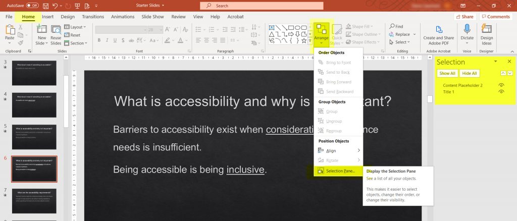
This opens a panel on the right hand side showing all slide content and it should be arranged from bottom to top.
Consider audio
Audio resources are a fantastic option for blind audience members. It’s important to ensure audio quality is good. If there’s two narrators on the audio, make sure they don’t talk over each other and background noise is at a minimum. Transcripts can also be downloaded and read by screen readers.
Keyboard accessibility
Audience members with low vision may use keyboard commands. This makes it possible to navigate web pages without having use and focus on a mouse cursor on screen. The use of keyboard shortcuts makes much easier for visually impaired audience members.
Descriptive links and buttons
Vague ‘click here’ linked text in documents or web pages doesn’t give audience members information on what the link is about. Screen-reader users often use keyboard shortcuts to list page links for more efficient navigation.
If most link text is ‘click here’, it provides little context as to what users are clicking on. It is important to add description to link labels which makes sense when viewed out-of-context. This is best-practice which benefits all users. Descriptive links promote scanning of information for sighted users.
To find out more on how to design for screen readers, have a look at webaim.org for hints and tips.
Manual font size adjustment
Whilst there are numerous ways to improve accessibility for the visually impaired, such as magnifying software and the ability to adjust text size in-browser. Many people with vision impairment may not use magnifying software and/or not be familiar with browser text size adjustment features.
Colour and contrast
Ensure text has a good contrast ratio for readability. This is the colour of text on its background. Text size is another consideration. The WCAG 2.0 level AA requires a contrast ratio of 4.5:1 for normal text and 3:1 for large text (i.e., 14 pt and bold or bigger; or 18 pt or bigger).
Color contrast checkers can check the contrast within this WCAG standard. It is a good idea to bookmark the colour checker and standards and guidelines listed by WCAG.
Do consider graphs/chart colour information and incorporate pattern into the mix. This allows audience members with contrast issues to still interpret the information presented without the need of colour.
Following on from this, let’s have a look at Assistive Technologies (ATs) to help audience members with vision impairment.
Assistive technologies available
What are Assistive Technologies (AT)? These are technologies specifically designed to assist people living with disability. AT covers a vast number of technologies for all sorts of assistance, we will list a few we have available at Queen’s specifically for blind/low vision audience members. These include:
- Talk&type
- Text to Speech
- Screen masking
- Magnify
- Narrator/JAWs
When creating digital content, text can be used with assistive technologies, (i.e., Narrator/JAWs screen readers or Immersive Reader) which can read text to blind and low vision audience members.
Whilst most computing devices currently have screen readers, magnifiers, colour/contrast controls and other useful accessibility aids built in, we’ve provided a few from both Microsoft & Apple which can be used for audience members with vision impairment.
Microsoft
The Microsoft corporation has added many accessibility features to their software applications. These include:
- Microsoft accessibility (overview)
- Immersive readers (reads digital text)
- Dictate (types up speech)
- Dark Mode (changes contrast)
Apple
Apple has a number of accessibility features built in:
- Apple accessibility (overview)
- VoiceOver (converts text to speech)
Mobile Apps
Other downloadable apps include:
- Speechify (converts text to speech)
- Tap Tap See (provides verbal description of items captured by photo/video)
- Be My Eyes (provides verbal description of items captured through video calls)
Resources
Just to give some assistance regards improving digital accessibility when designing content, we’d like to re-share some blog posts to improve accessibility:
- Text
- Visual Information
- Video
- Audio
- Colour Alternatives
- Using MS PowerPoint
- Using MS Word
Summary
Whilst there are many services, assistive technologies and Apps available to assist people living with blindness or low/no vision, we cannot list everything here. There are some great resources which you can access at AT Hive which are broken down into specific categories.
We hope you have enjoyed this blog post and it helps you become more aware of the needs of audience members when creating content and other technologies available as well.
Next week
In our next blog post, we will be looking at audience members living with D/deafness and hard of hearing.
Remember, the DigiKnow blog posts are released at noon on a Monday.
Please do join us then to learn more and don’t forget to follow us on Twitter: @MDBSelearn.
0 Comments